 Commentary & Analysis
Commentary & Analysis
Commentary & Analysis
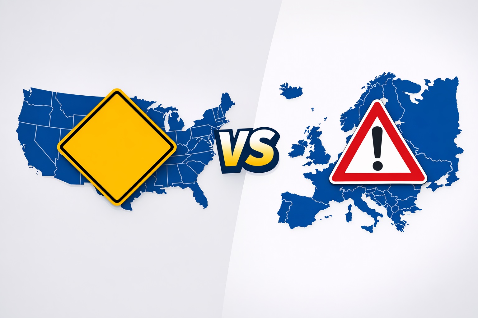
For decades, the US and Europe have driven toward the same destinations — television broadcast standards, cellular networks, container shipping, chip credit cards — and eventually converged on global solutions. Engineering pragmatism won out.
But one system resists convergence: road signs. Two continents, two completely different graphic languages, and no serious effort to reconcile them.
It's time to compare them honestly.
Have you ever stopped by this sign and wondered why it has to be like this?
Traffic signs in Europe are, for the most part, better than the MUTCD-based US signs. But the time has come to take the best of both worlds.
US signs are based on the Manual of Uniform Traffic Control Devices. The most notable characteristic is the extensive use of English text, and the iconic yellow diamond-shaped warning sign.
The US system started becoming inconsistent when Americans began to incorporate a shy number of pictograms. It's not a big deal — the intent is normally clear — but it could not be ideal from an aesthetic point of view. We'll see why that matters.
For instance, the "no left turn" sign is not just text in a white rectangular panel, but a curved arrow inside a red circle with a red slash. The sign itself remains square or rectangular — a white panel as regulatory signs are supposed to be — but with a circle drawn inside.
Europe and most world countries base traffic regulations on the Vienna Convention. The most notable characteristics are the near-consistent use of pictograms and the red/white triangular shaped warning — a.k.a. danger — signs.
The Vienna scheme is very consistent and respects a recognizable logic across the signs. The issue arises when logic is followed at the expense of clarity. The main example: the no-parking sign, which has no intuitive meaning in a system where traffic images are designed to be intuitive.
Only recently did gen AI models manage to explain the logic behind the red-barred blue disk that supposedly prohibits parking. The P on blue indicates a facility (a garage or lot), not the action of parking — so prohibition uses the color blue in a red circle with a slash.
The parking sign is a blue sign with a P, for parking. According to established interpretation, this P indicates a facility — like a garage or a parking lot — not the action of parking itself.
This distinction matters enormously. The prohibition of parking cannot, therefore, be described by a barred or slashed P. Instead, the Vienna Convention system decided to represent it through the color blue: hence, the color blue in a red circle with a red slash tells you not to pull up here.
Do you agree that it's a bad choice? The sign asks drivers to perform a three-step logical decoding under time pressure. Blue = parking facility. Red circle slash = prohibition. Therefore = no parking. That's two layers of abstraction when one would suffice.
The European system wins on consistency and visual hierarchy. The American system wins on immediate legibility and the use of color psychology that mirrors nature's own warning palette.
A reformed standard would keep Europe's pictographic rigor and prohibition circle, adopt America's yellow-black for warnings where visibility matters most, and — critically — redesign the parking prohibition so that any driver, anywhere in the world, can parse it without a logic puzzle.
Highway journeys should be a relaxing experience. Clearer signs are a small but meaningful step toward that.